Allstate Identity Protection
In late 2018, InfoArmor Identity Protection was acquired by Allstate as part of a strategic initiative to expand Allstate’s offerings beyond property and casualty. As part of the rebrand to Allstate Identity Protection, we redesigned the customer web portal to address some glaring usability issues and prepare the application for mainstream consumption through a Direct to Consumer channel.

Project overview
My Role
As Director of Product Design at Allstate Identity Protection, I was responsible for leading the design team on the research, design, validation, and asset delivery for this project. I was really lucky to have an amazing team to work with who was able to move fast and provide big improvements to the overall experience of the product in a very short amount of time.
Project goals
Update the interface to adopt the Allstate design language and better reflect the Allstate brand
Address glaring usability issues and UI inconsistencies in the core experience
Update and optimize the first time experience for the direct to consumer channel
Reinforce the benefits of core features within the product experience to drive feature adoption
Research & Insights
Mapping out the pain points
As the team set out for the redesign, we wanted to capture and validate critical areas of opportunity to improve the overall experience. We already knew there were significant usability issues we wanted to address, but nothing ever beats speaking with actual users to see where you are missing the mark.
We conducted several user interviews with current and recently churned customers to see where they struggled with the experience. The findings were very revealing. Not only were we off on the most critical areas to focus on, but we uncovered issues we had not considered.

Journey map with key painpoints
Key problems to solve

Users were unclear on what benefit each feature provided
Users were unclear on how to set up the product to get the most value
Users were not sure if the product was working
Design approach
Design approach
Based on our research findings, we decided to focus on a few critical areas of the user experience.
- Make sure users can quickly get onboarded
- Provide a clear explanation of what each feature does
- Continuously show the value we are providing
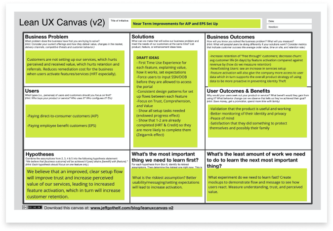
Lean UX Canvas
Armed with our customer insights, we documented our business cases to tack on more scope to the rebrand project. We used the Lean UX Canvas to record our thinking.
Initial sketches
Clear on what we were trying to accomplish, we ran a series of quick design studios with the design team, a Product Manager, and a Content Strategist. These studio sessions, with members from across the product team, are great for getting a bunch of ideas with different perspectives quickly. Below are some of the initial sketches from the team that came out of one of the design studio sessions.

User and system flow
Now that we had a clear idea of the areas we would need to address, our hypotheses on how to fix them, and documented measures of success, we mapped out our new user and system flow. When thinking through the project’s user flow, I like to include the overall system and UI flow. There are a couple of reasons for this; to document all of the UI elements that need to account for and make sure there is clear understanding of how the backend will handle it, and confirm with our development partners that we can build it.

Early wireframes
Some of the early wireframes from the project. We had an established design library so our wireframes were often high(ish) fidelity. I’ve found that this actually helps with early validation as well.

Testing with users
We ran this project very lean. The team wanted to gain as much confidence in our design direction as we could, as quickly as possible. We imposed a mandate of testing with live users every Thursday until we felt we were in a good place, with a time constraint of 3 weeks.
After each user interview, the team would document the issues found with each test. We would then affinity map those issues into buckets of issues we could tackle in the next design iteration. By the end of these tests, we were seeing very few usability issues and the test candidates had no issues going through our onboarding flow and could clearly articulate what each product feature did.


High fidelity designs
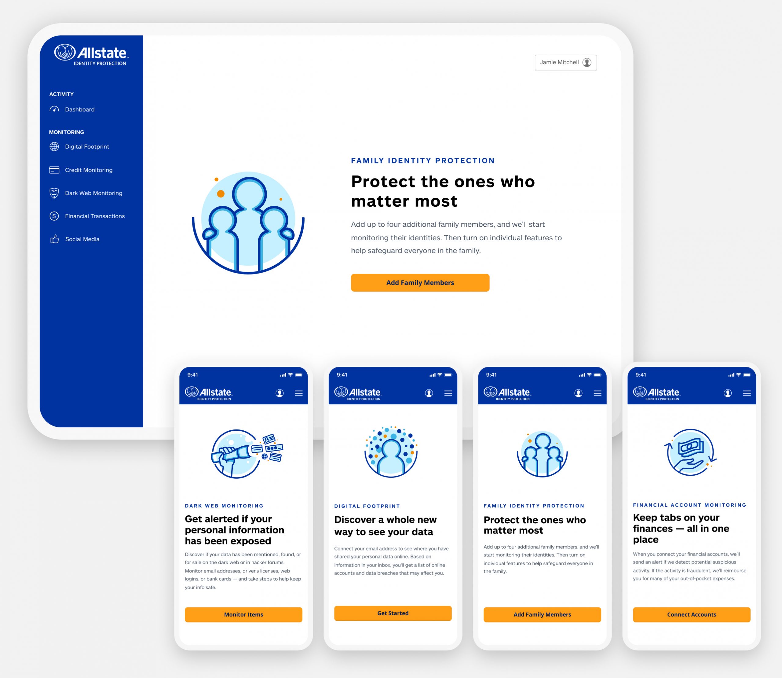
Improved onboarding
One of the biggest issues with the existing experience was a lack of a clear path to get fully onboarded. To get basic value from the product users needed to bounce around the portal to enter information and answer security questions, sometimes being forced to enter the same info twice. We addressed this by putting the onboarding on rails and requiring profile completion right after purchase. This would ensure customers entered all of the information we needed to fully protect them (only once) and get them to value right away.

Feature page introductions
Our research showed that people often didn’t understand what the individual product features did. They often were confused about the benefit or afraid to enter their personal information to activate it. This obviously lowered trust and impeded value perception. Our solution was to update each feature page’s initial states with detailed, well-written content explaining each feature’s benefit an how to set it up.
Updated dashboard
The team also made some updates to the dashboard. We added a “What we are monitoring” checklist to help with feature activation and to continuously show the customer the value of the product. In addition, working with our content team, we cleaned up the alerts section and updated the copy to help customers better understand what each alert means.
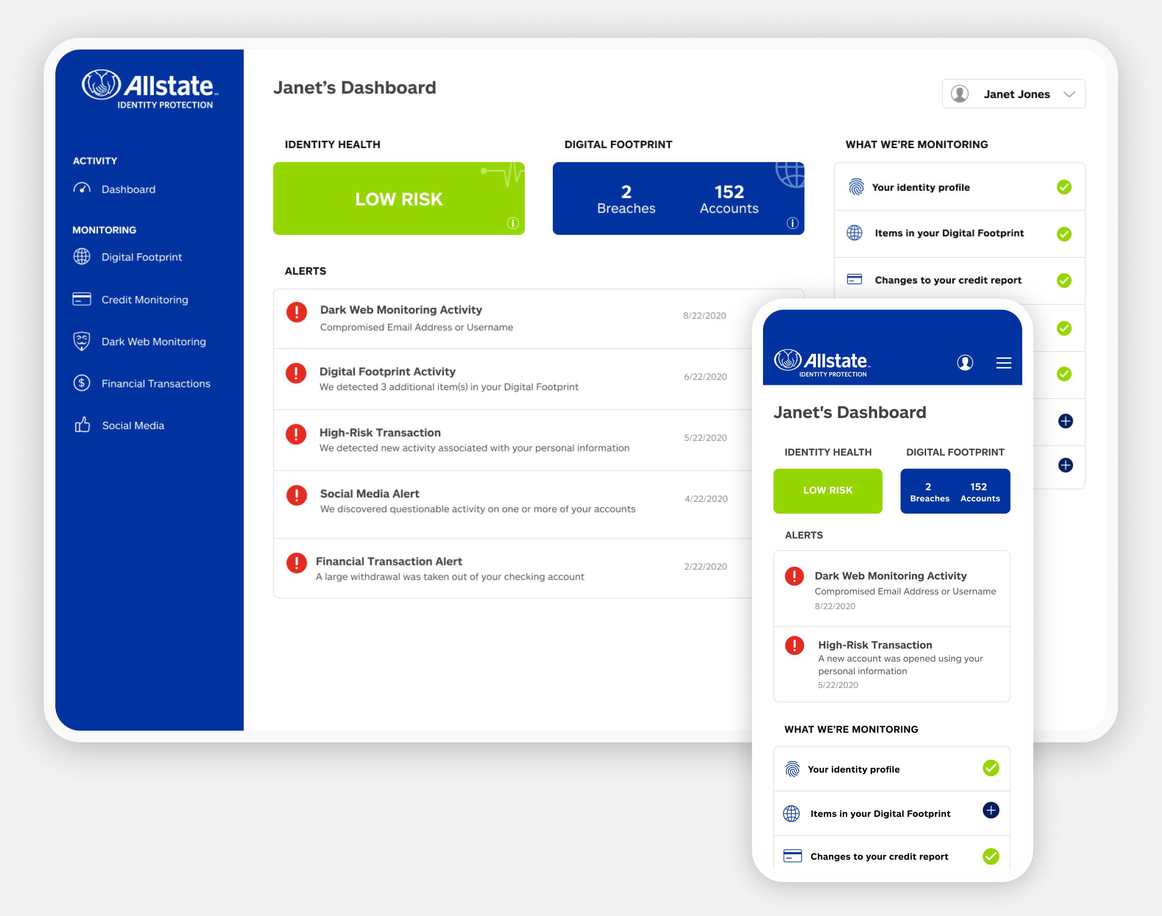

Protection checklist
Our analytics showed that only about 40% of our direct to consumer customers had the essential features activated (Credit Monitoring & Dark Web Monitoring) within the product. The numbers were even lower on some of the other secondary monitoring services. To promote feature adoption and show value, we added a “feature checklist,” using plain language to highlight what each feature does, to the dashboard.
Improved alerts and resolution interactions
A significant driver of call volume to customer care is alert confusion. There are several reasons for this; the most significant issue was how we would display the data returned to us from our identity monitoring vendor in an alert. Often the alert description was cryptic. Most of the time, it was triggered by a transaction the customer had initiated. Either way, if the customer couldn’t understand or recognize an alert, they were calling us. This makes total sense, when you get an alert from your identity protection provider, it causes concern if not alarm.
While we could not fix everything we wanted to with this iteration, we made some fantastic improvements with the copy on the most common alerts and the alert disposition interaction.
")
![]() Previous Project
Previous Project
![]() Next Project
Next Project
